C2HO
University of Oslo, Norway
Art Direction / Visual Identity
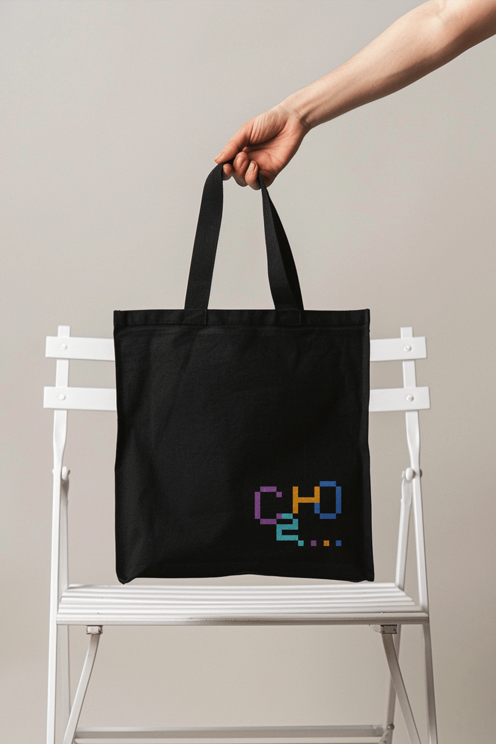
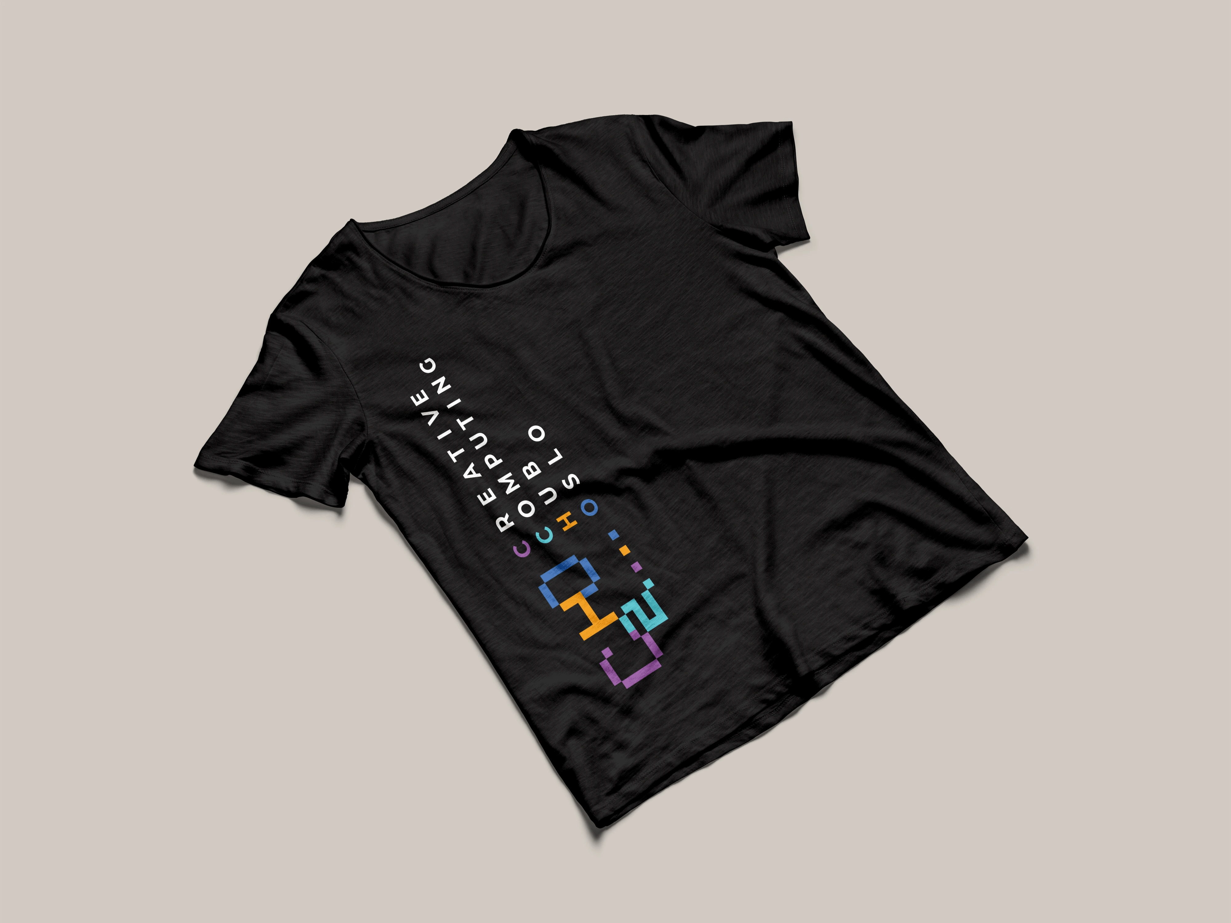
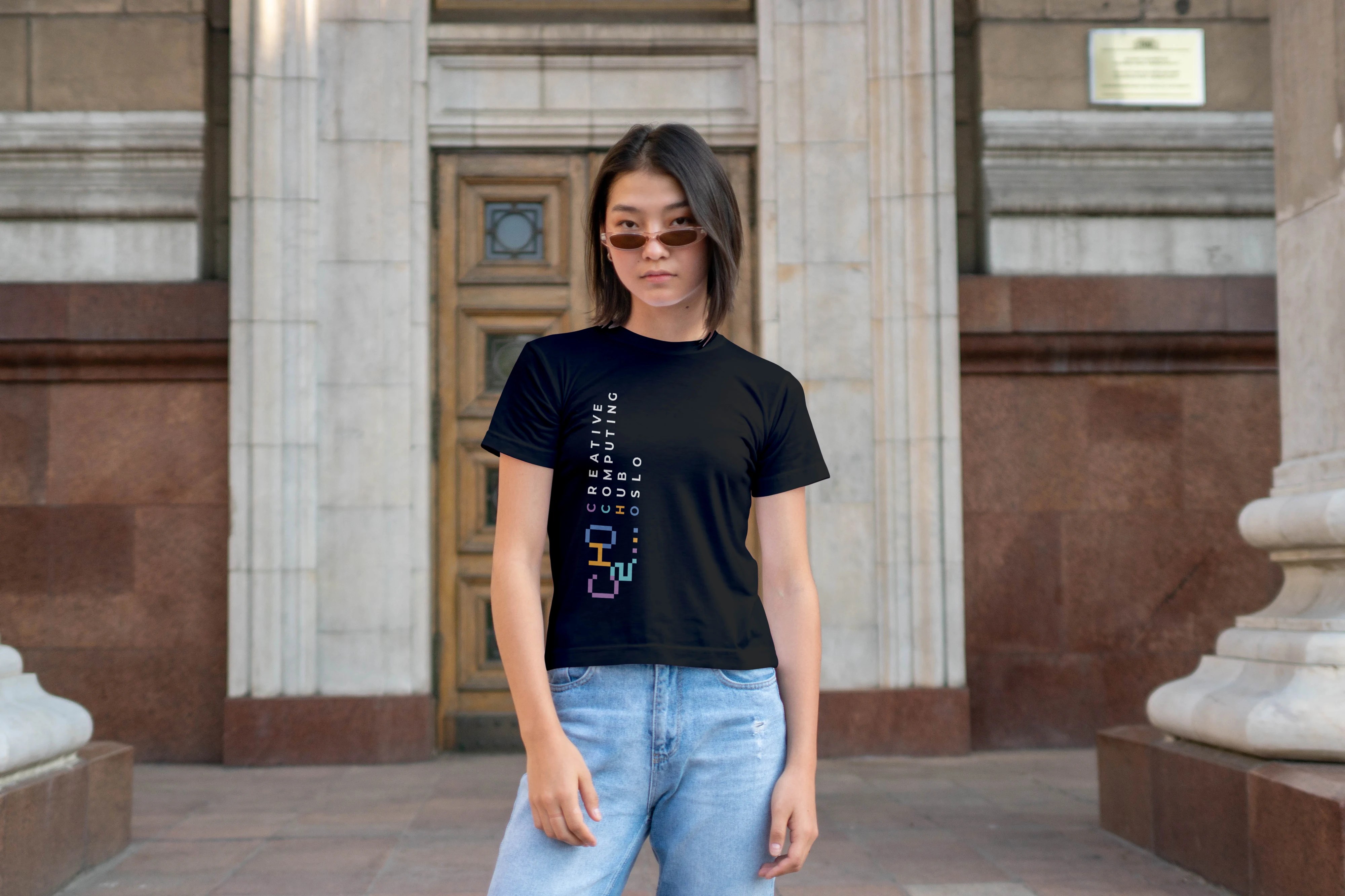
Merch / Indoor & Outdoor Branding
Animation / Social Media
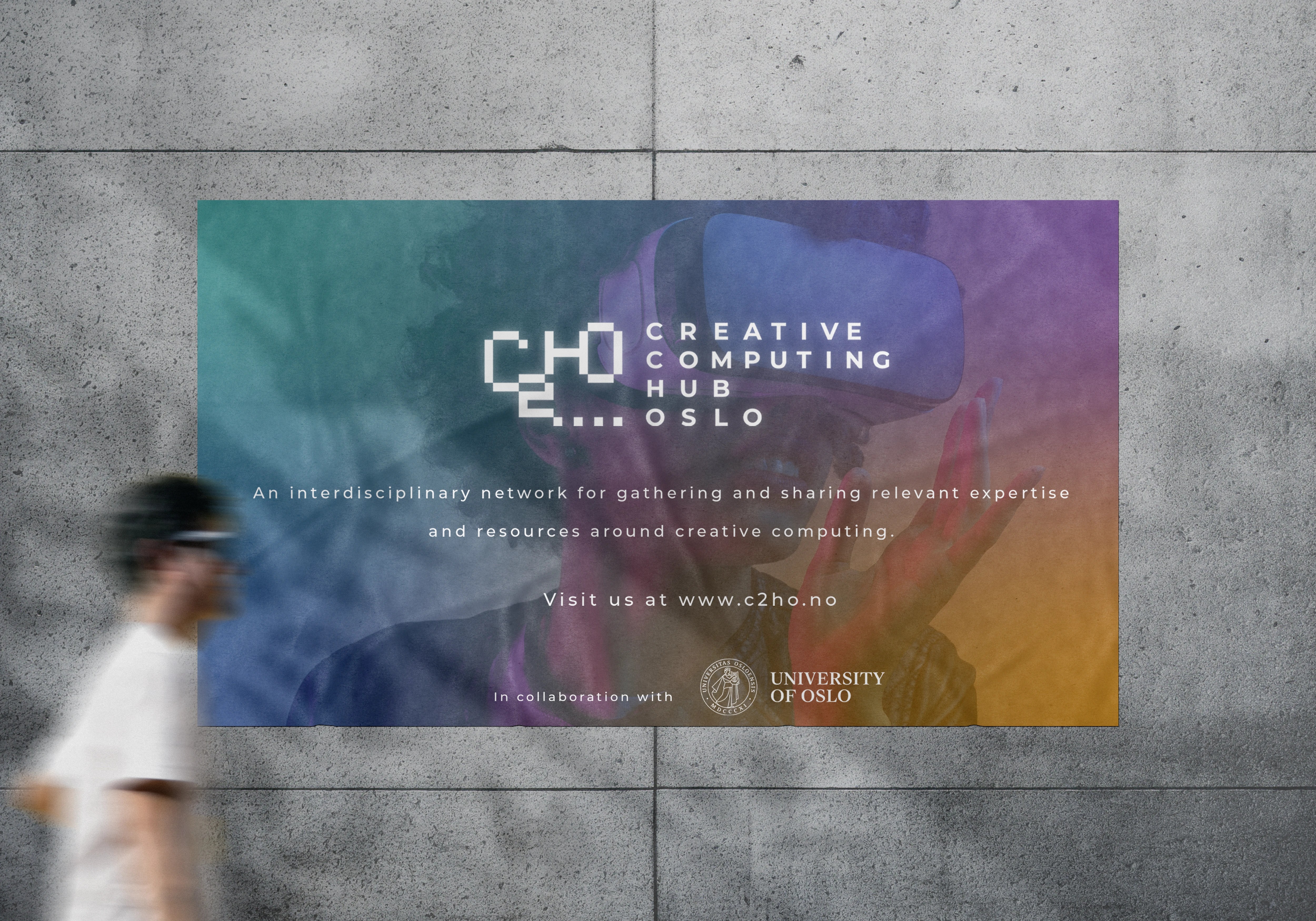
C2HO is an interdisciplinary international network for gathering and sharing relevant expertise and resources around creative computing. Part of the Musicology Department in the University of Oslo, Norway, it is a new programme aimed at teaching students about fun ways to fuse music and computer science as one.


COLOUR IDENTITY
The colours were chosen to represent each of the entities of the logo respectively. Purple is used to represent full creativity, at its highest potential. Turquoise is used to represent high intelligence in computing. Orange is used to showcase the aspect of friendliness within community hubs, and lastly blue is used to signify the calm nature and coolness of Oslo.
Montserrat Bold
( Header Copy )
Aa Bb Cc Dd Ee Ff Gg Hh Ii Jj Kk Ll Mm
Nn Oo Pp Qq Rr Ss Tt Uu Vv Ww Xx Yy Zz
123456789ÅåÆæØø
!”#$%&/()=?`@*-
Montserrat Medium
( Body Copy )
Aa Bb Cc Dd Ee Ff Gg Hh Ii Jj Kk Ll Mm
Nn Oo Pp Qq Rr Ss Tt Uu Vv Ww Xx Yy Zz
123456789ÅåÆæØø
!”#$%&/()=?`@*-
TYPOGRAPHY
Montserrat is chosen as C2HO’s typographic font, as it possesses a modern and professional yet approachable look. Its clean lines and geometric structure lend it a contemporary and polished feel.

SOCIAL MEDIA
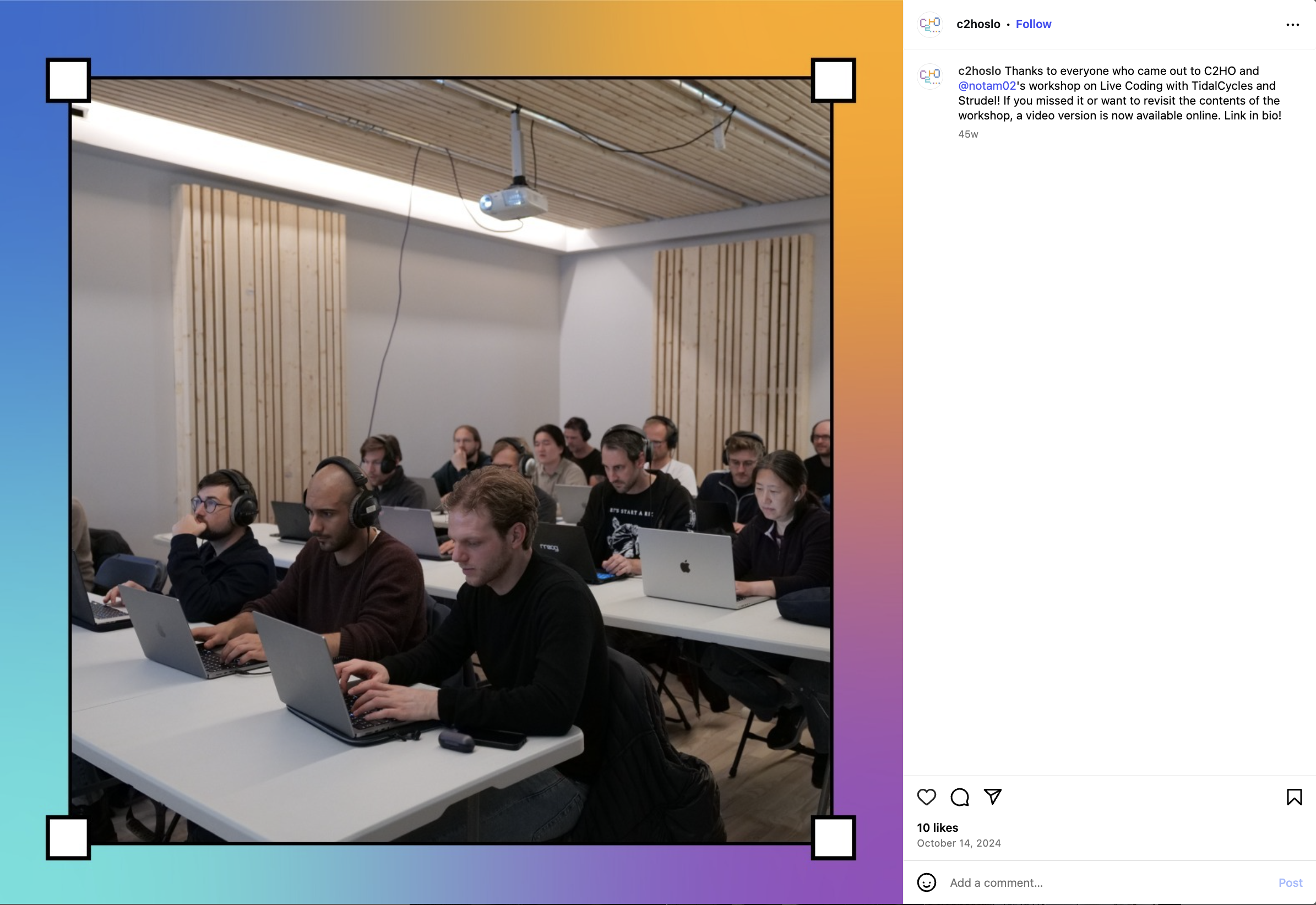
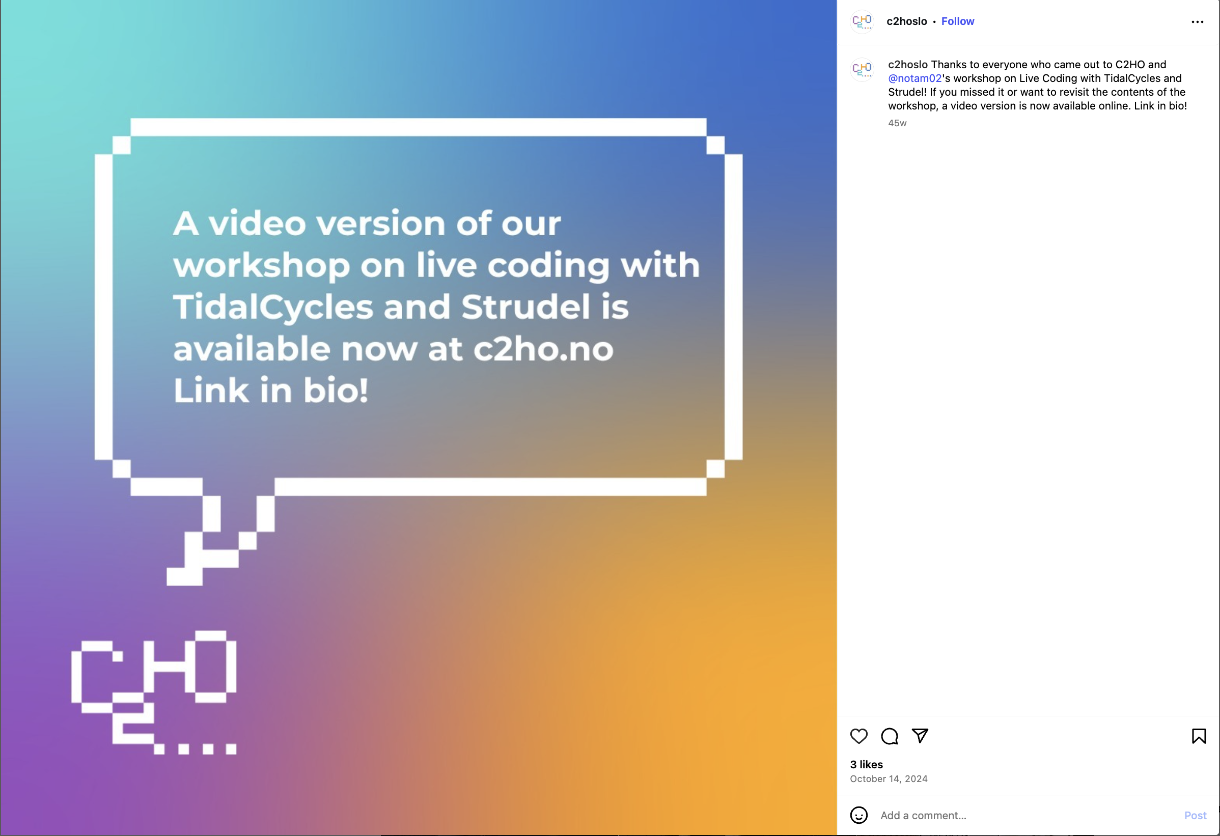
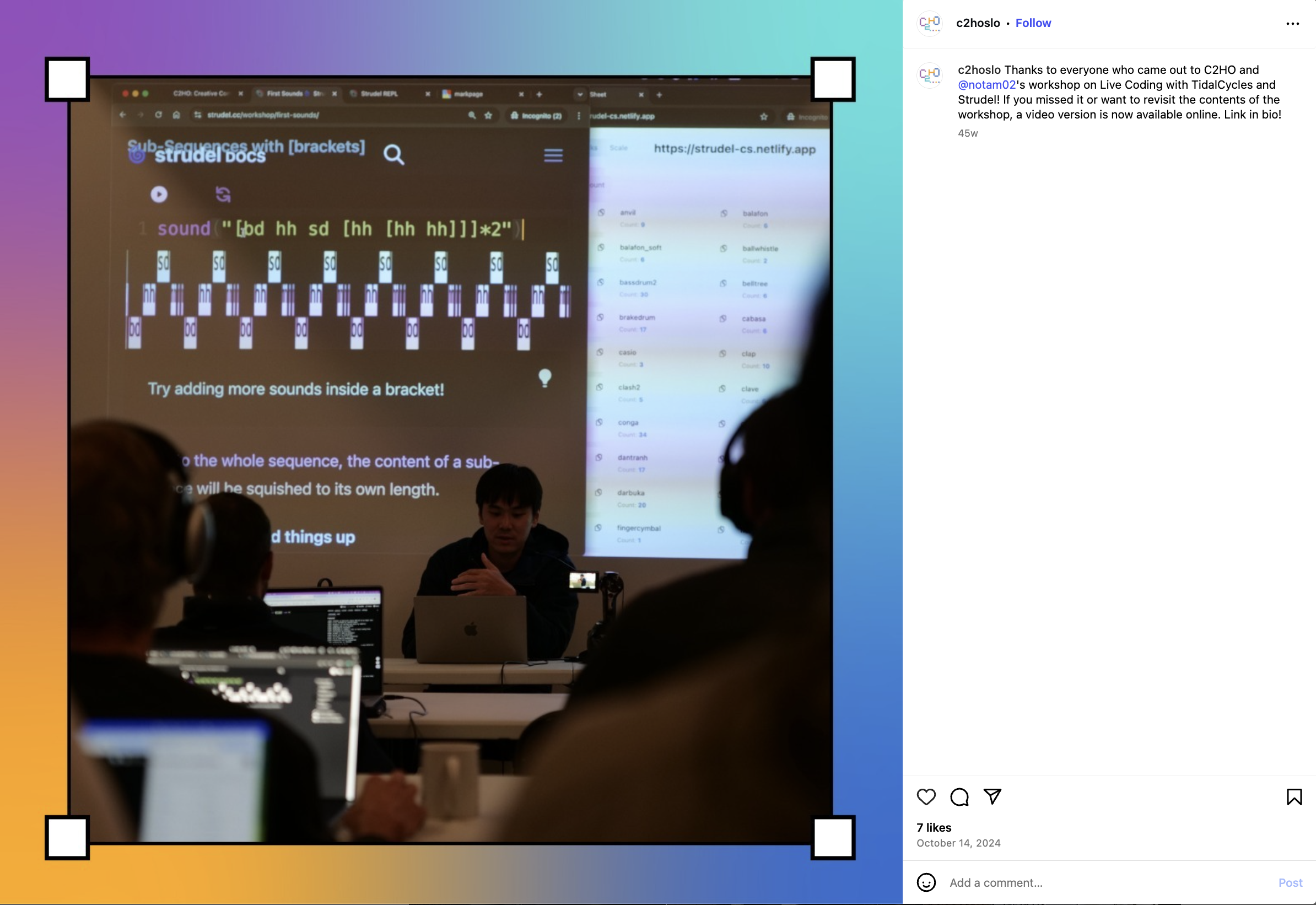
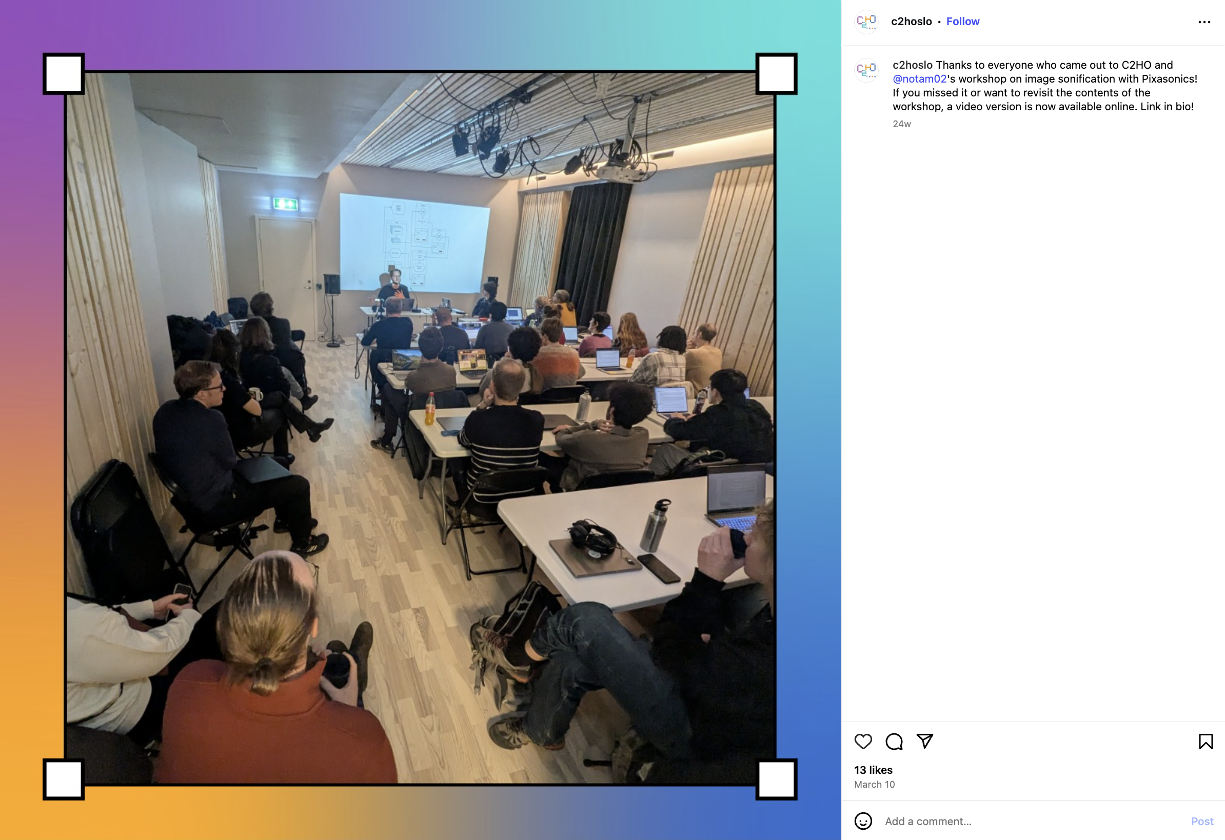
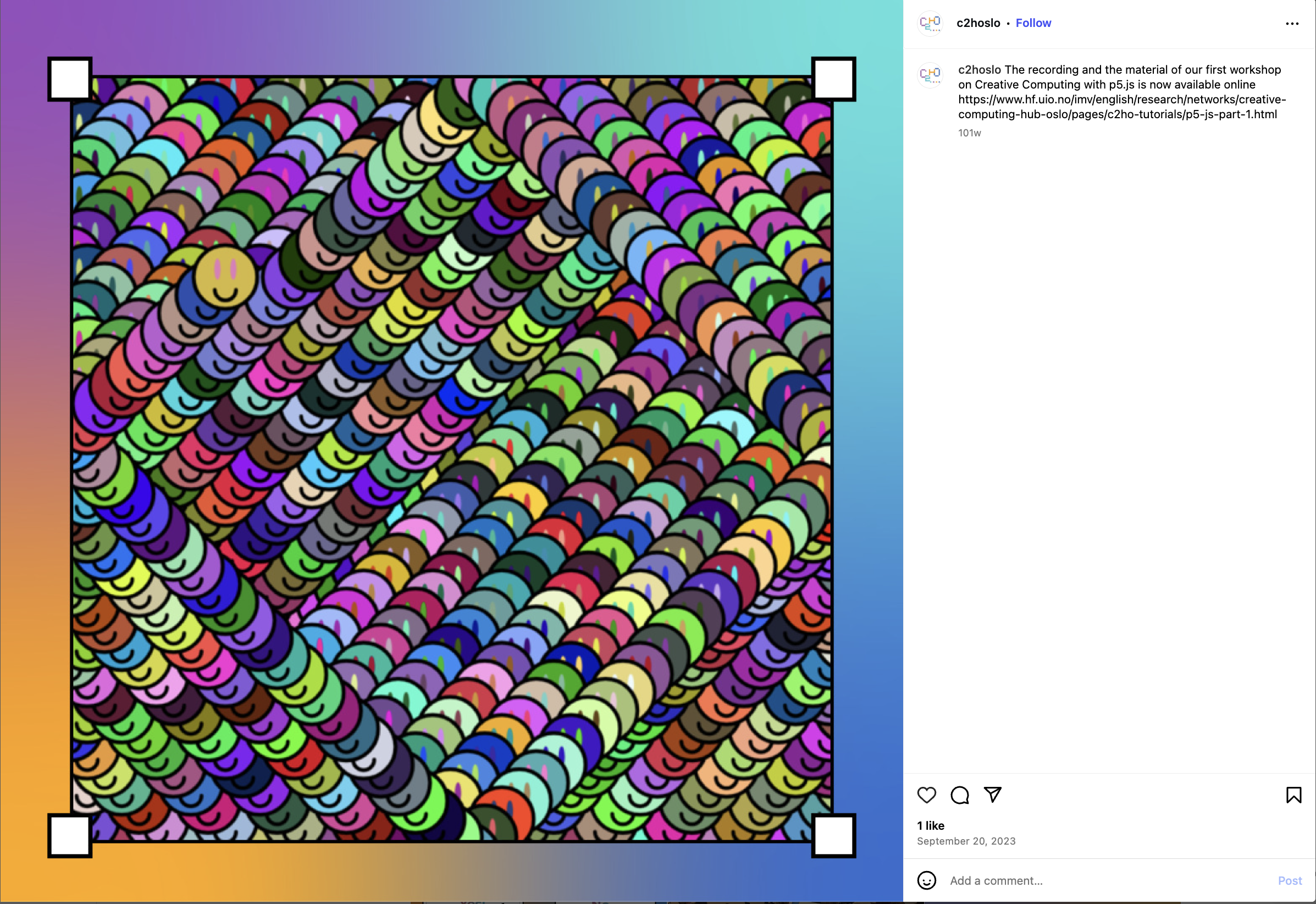
A strategic approach was developed for a series of Instagram posts for C2HO, leveraging on the chosen vibrant colours and playful design to create visually appealing and cohesive content.











INDOOR + OUTDOOR BRANDING
Indoor and outdoor advertising will be used to promote the new course, as well as to communicate the event itinerary internally.



COURSE MERCHANDISE
Branded merchandise and event collaterals designed to spark interest and raise awareness about the program to students that have signed up and to entice new ones to join.
