KEO KJØKKEN
Kitchen & Home Interior
Art Direction / Key Strategy / Social Media
Window Facade / Print / UI / Collaterals
KEO is a kitchen supplier in Norway with elegant Nordic design, clean colours, smart details and German quality in every aspect. In addition, you choose a production process that no one else can match in terms of environmental friendliness and sustainability.
COLOR + ICON STRATEGY
KEO needed a clever way to raise awareness for their various home interior categories, beyond just kitchen interiors and appliances. To address this issue, I devised a solution by colour coding each category and designing a unique icon to represent them, creating a visually intuitive system for easy recognition in-store.


KJØKKEN
( KITCHENS )
HVITEVARER
( APPLIANCES )
GARDEROBE
( WARDROBE )
STUE
( LIVING ROOM )
BAD
( BATHROOM )
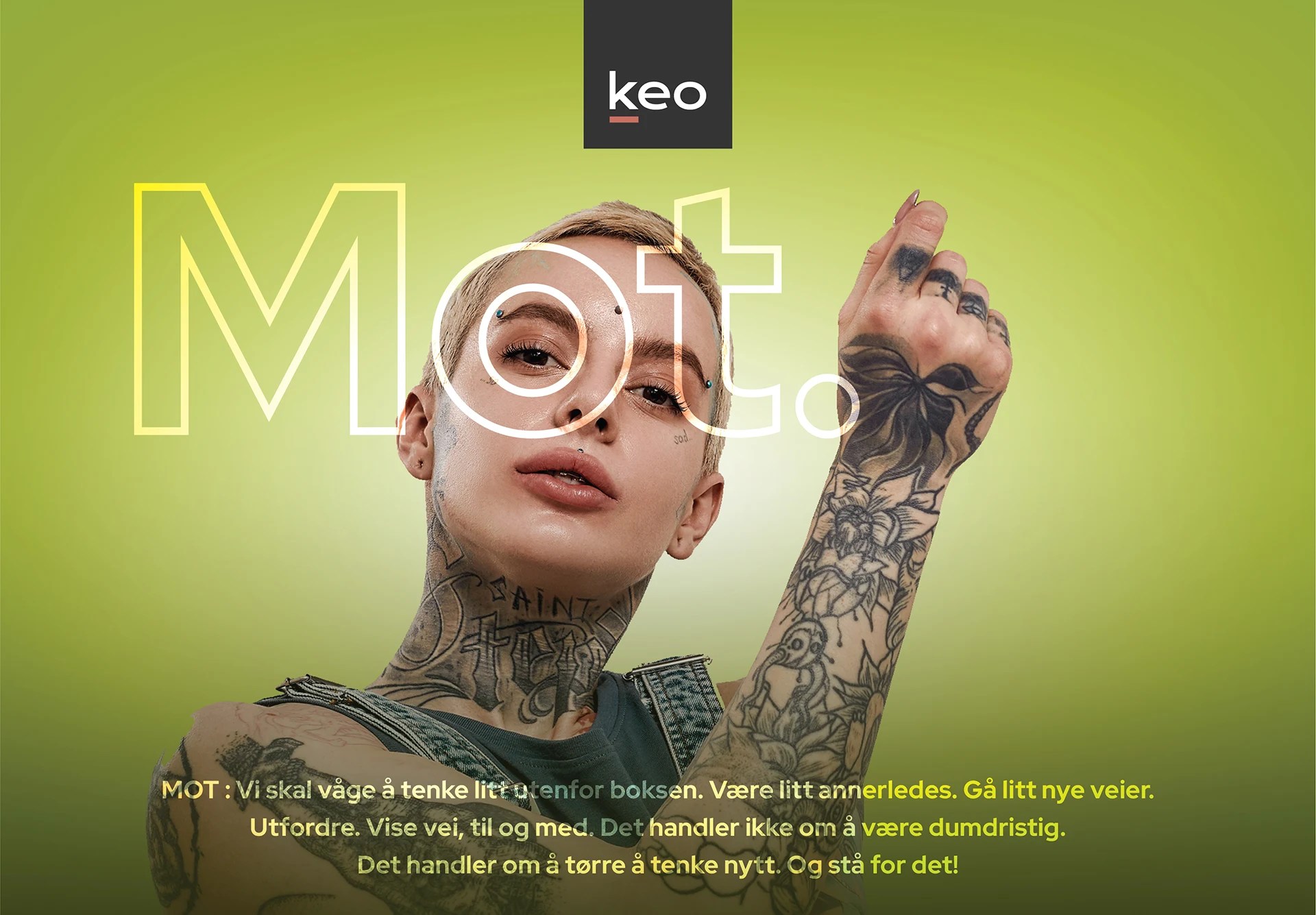
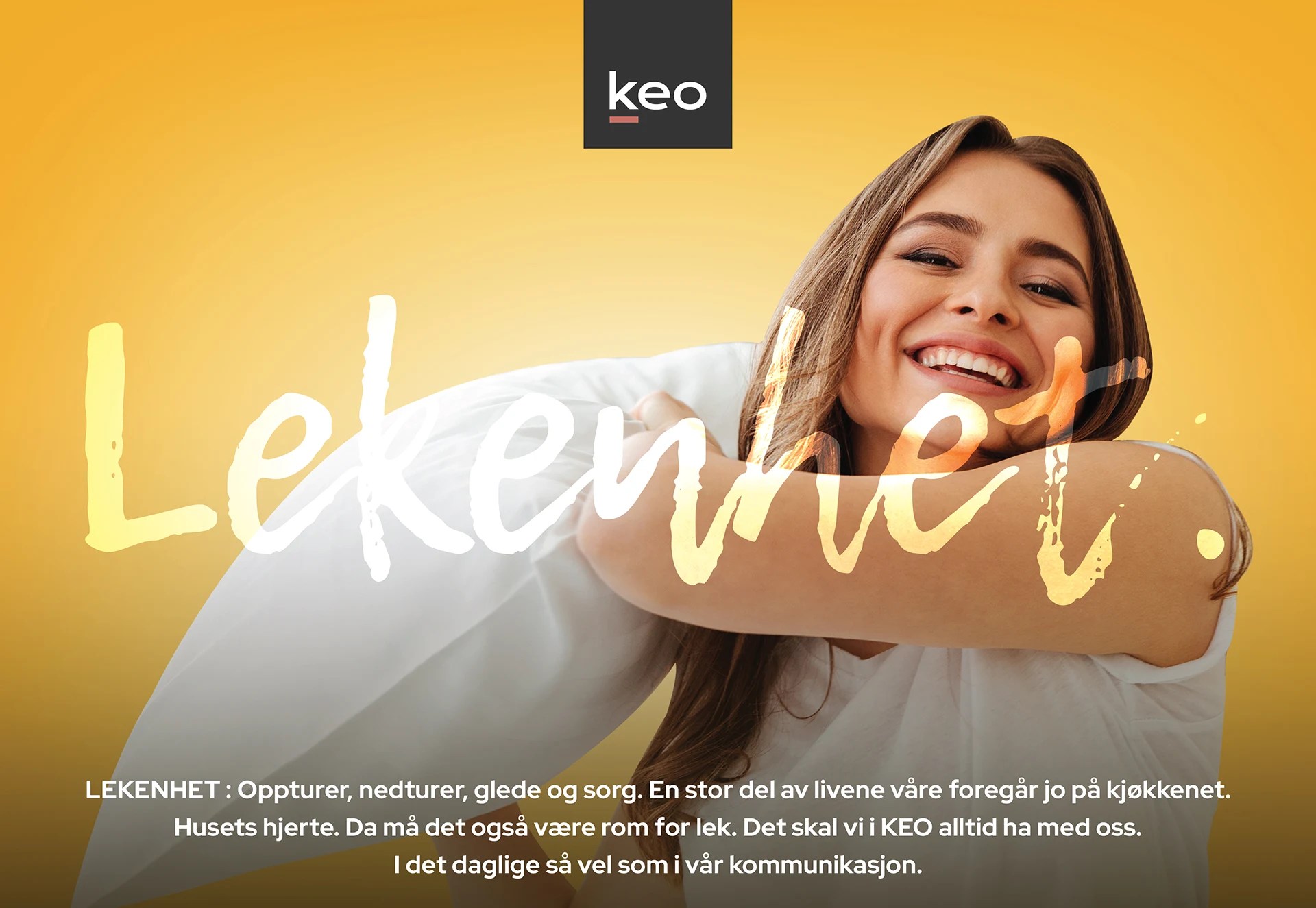
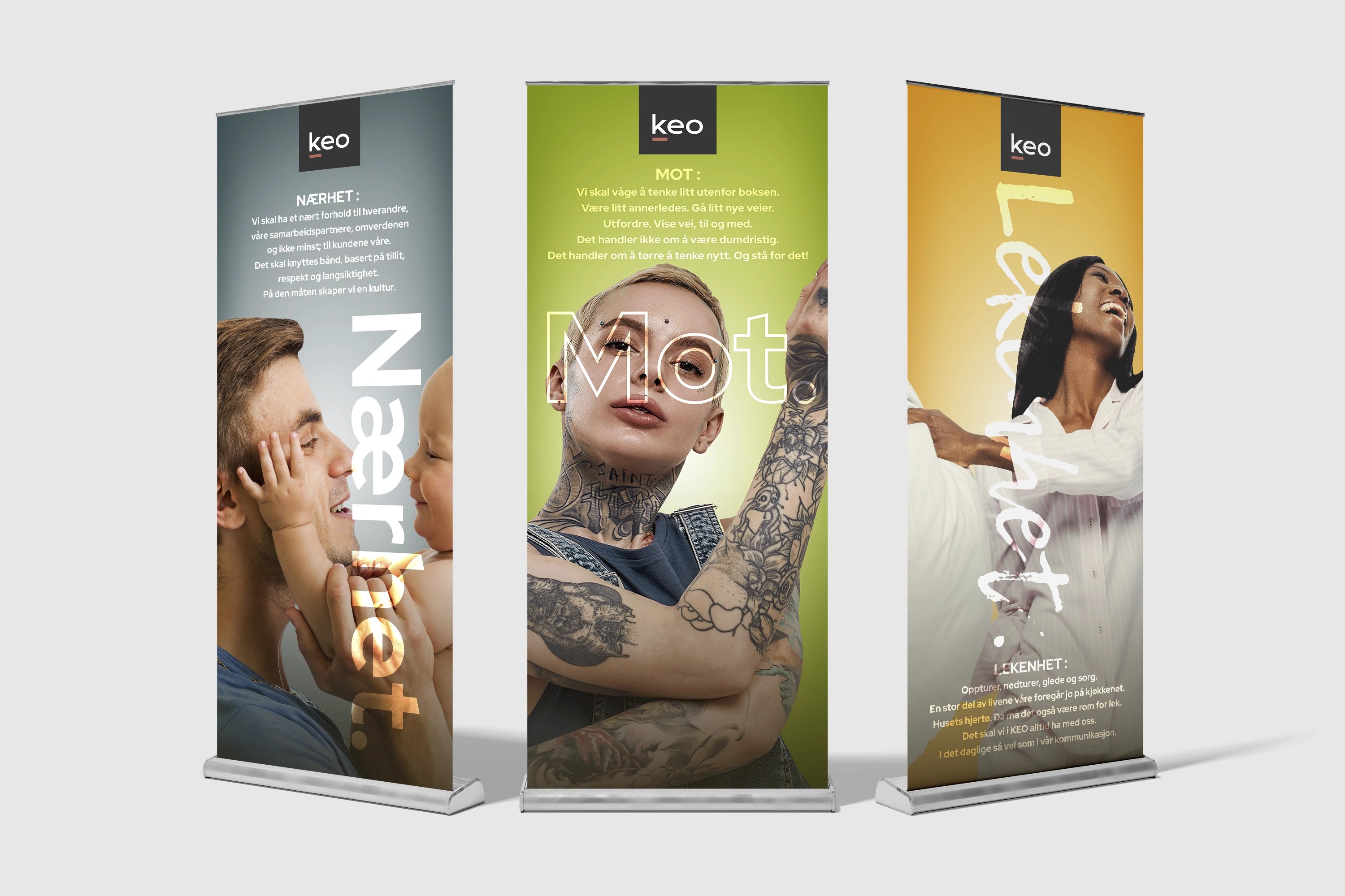
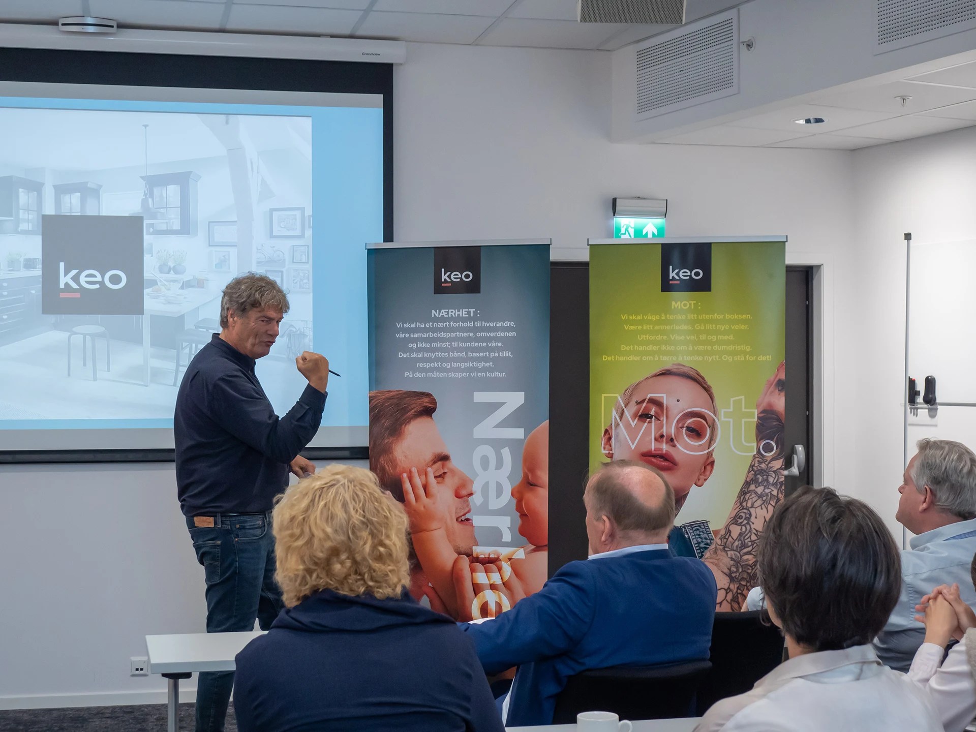
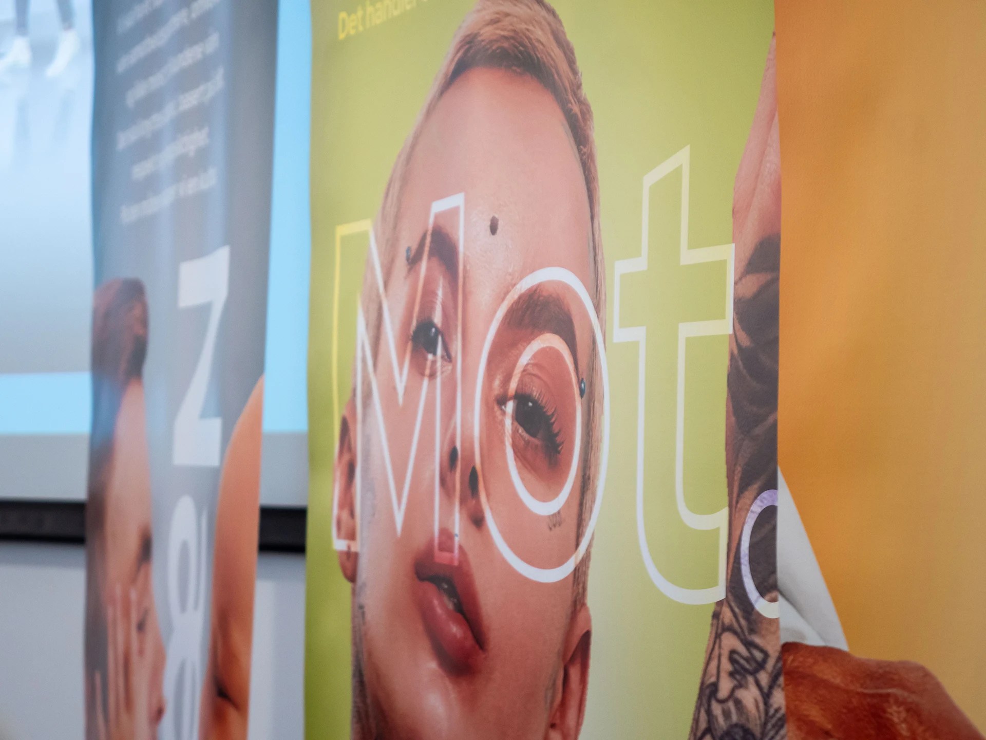
CORE VALUES
KEO requested three specific visuals to represent the company’s core values. Drawing from the vibrant colors in the new color strategy, I created three key visuals, each featuring an image of a person that embodies the corresponding human emotion, visually reinforcing the brand’s values.
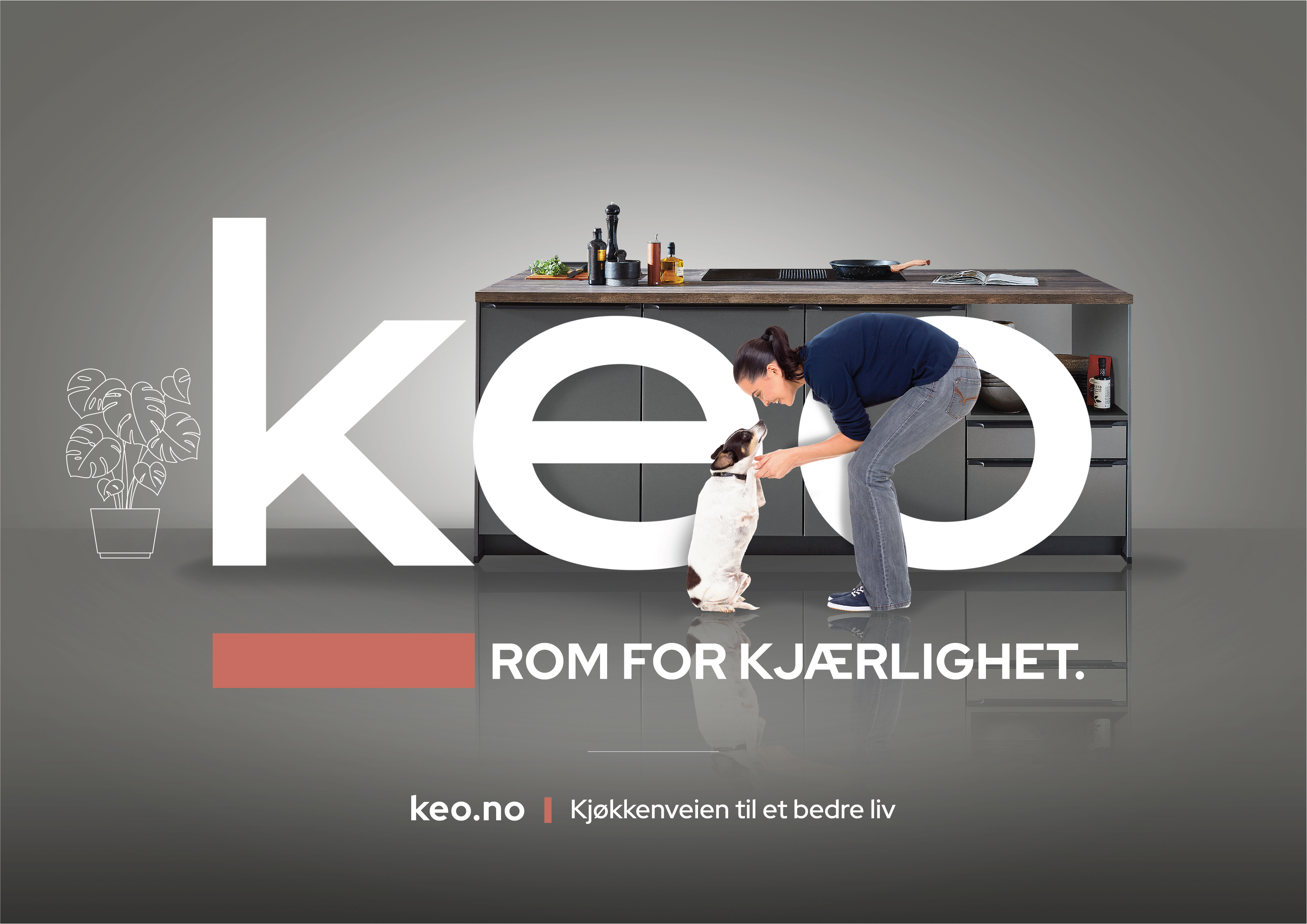
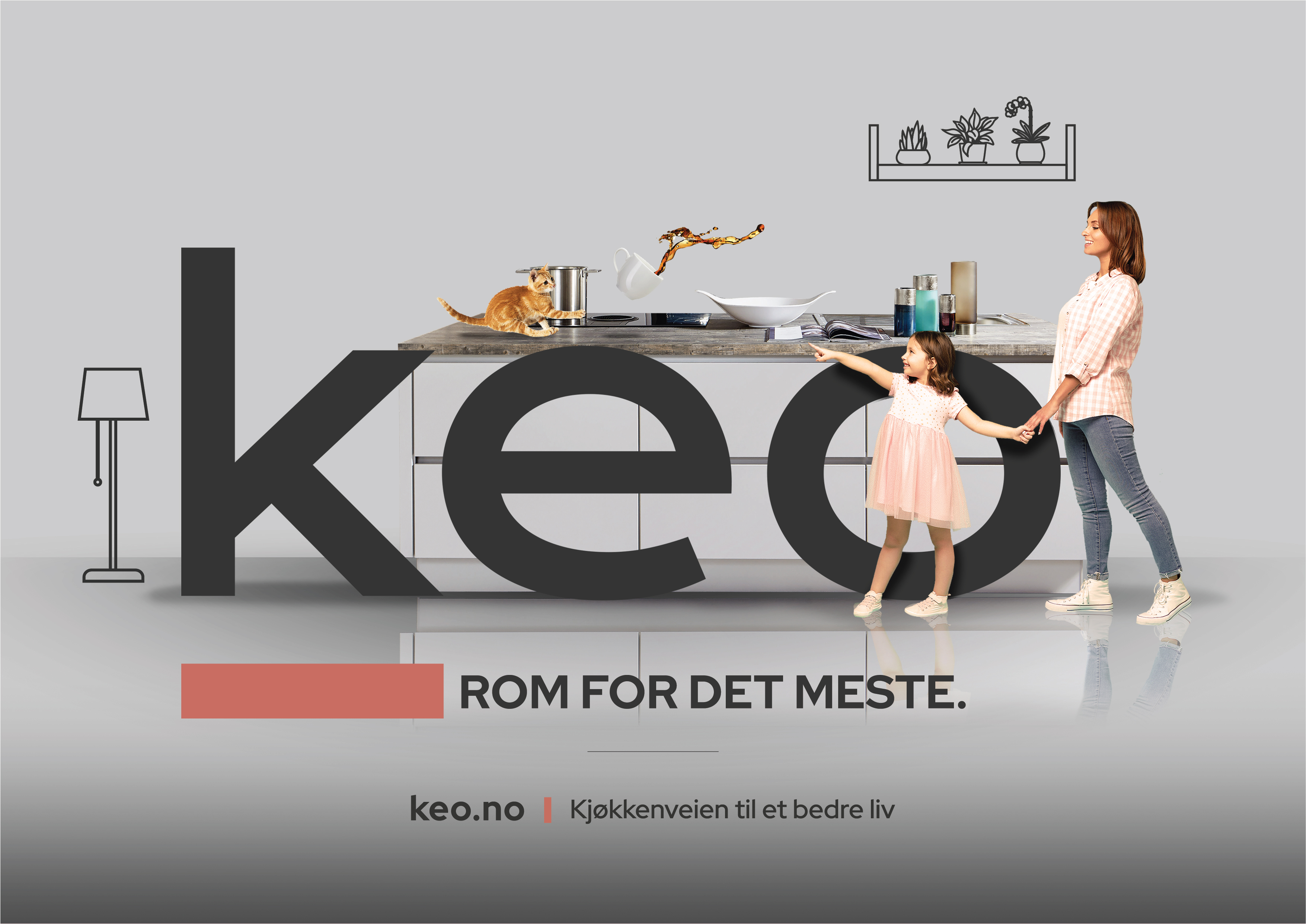
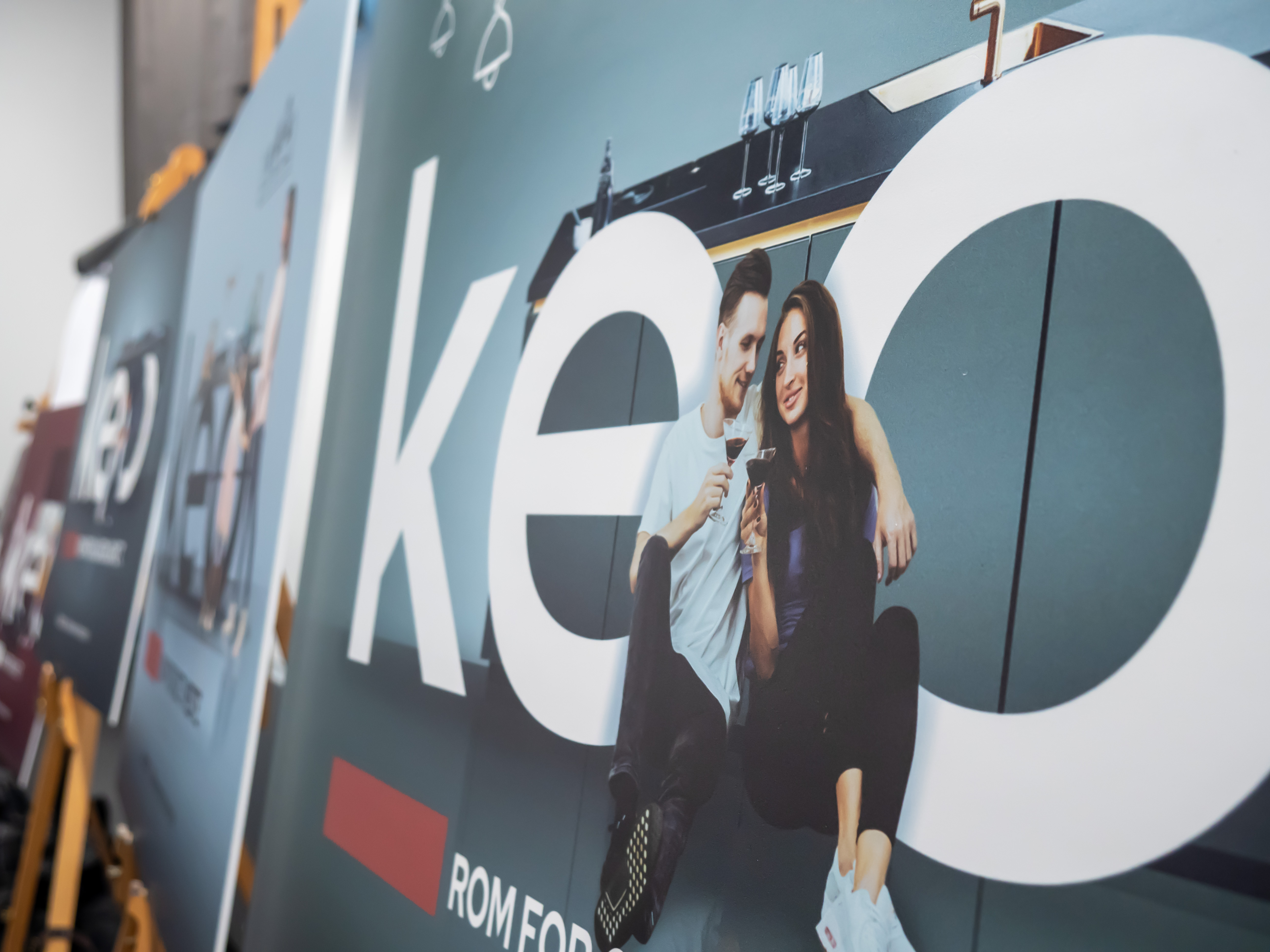
“ROOM FOR” CAMPAIGN
This campaign was crafted to showcase kitchens through a human lens, capturing emotions and everyday experiences in a single visual. The main tagline, ‘ROOM FOR (insert any evocative human feeling or experience),’ shifts kitchen advertising away from being just about the product, and instead focuses on the lives of the people who use these kitchens.

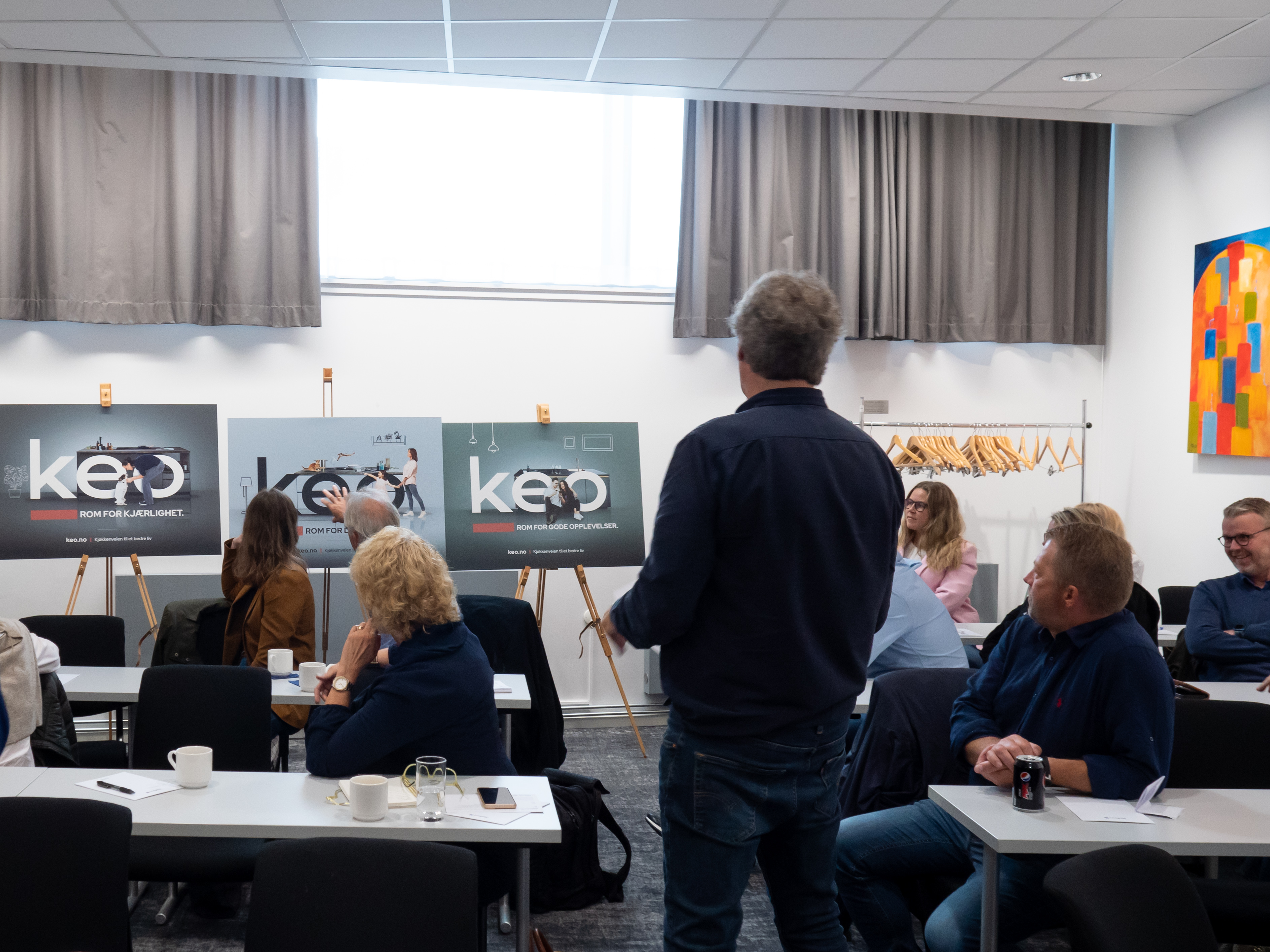
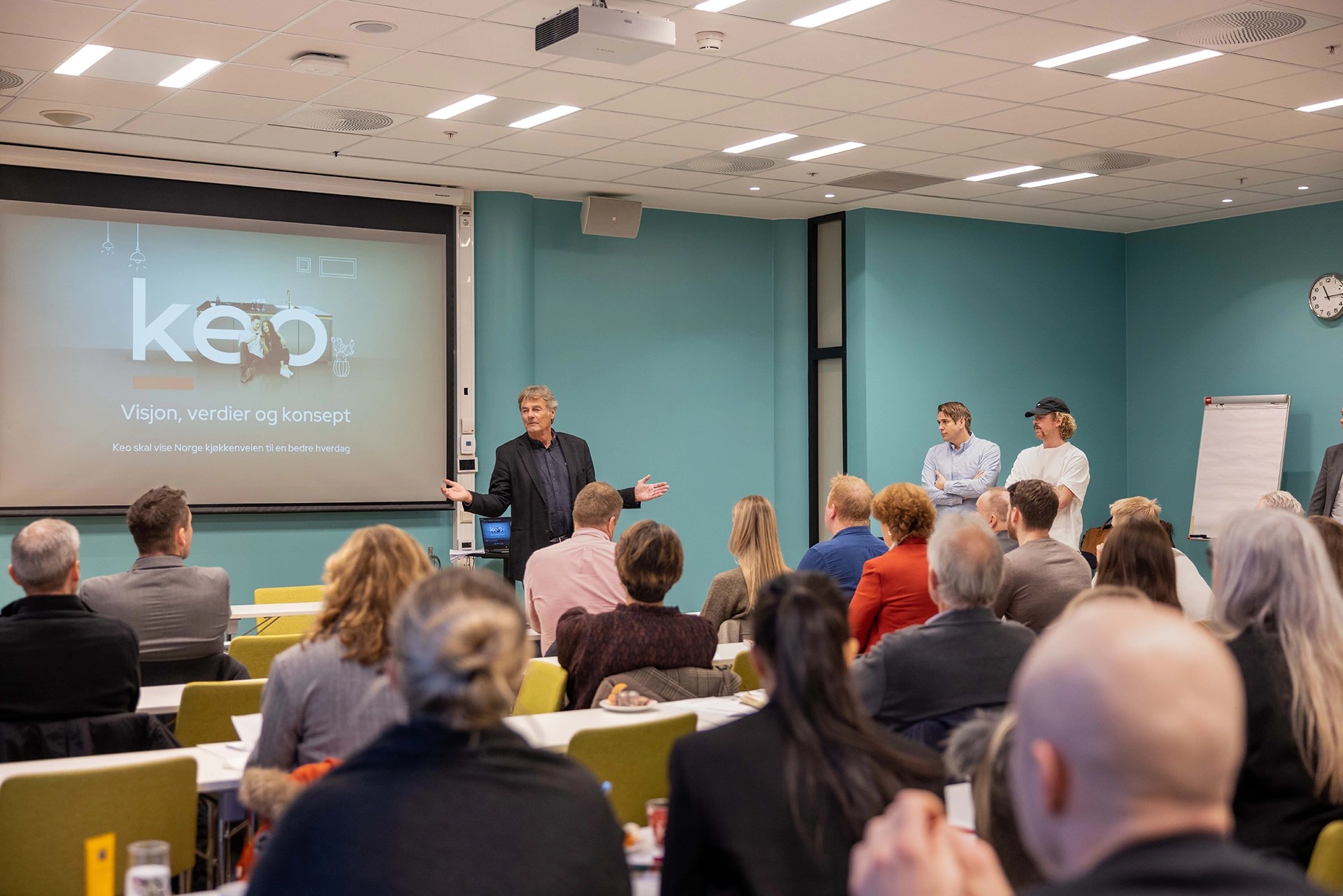
KEO @ OSLO AIRPORT
To welcome KEO’s partners from across Europe, we then used the fresh new colors and key strategies to present the essence of KEO, highlighting the company’s values, business approach, and vision.

UI DESIGN + SOCIAL CAMPAIGN
New UI design with refreshing visuals, along with a brand new social media deck and strategy for KEO, creating a modern and clean aesthetic with a fun pop of color and images of lively people.

NEW BRAND MANUAL
A brand new comprehensive brand manual for KEO, ensuring a cohesive and engaging digital and print presence for internal and external usage.