VINDER AS
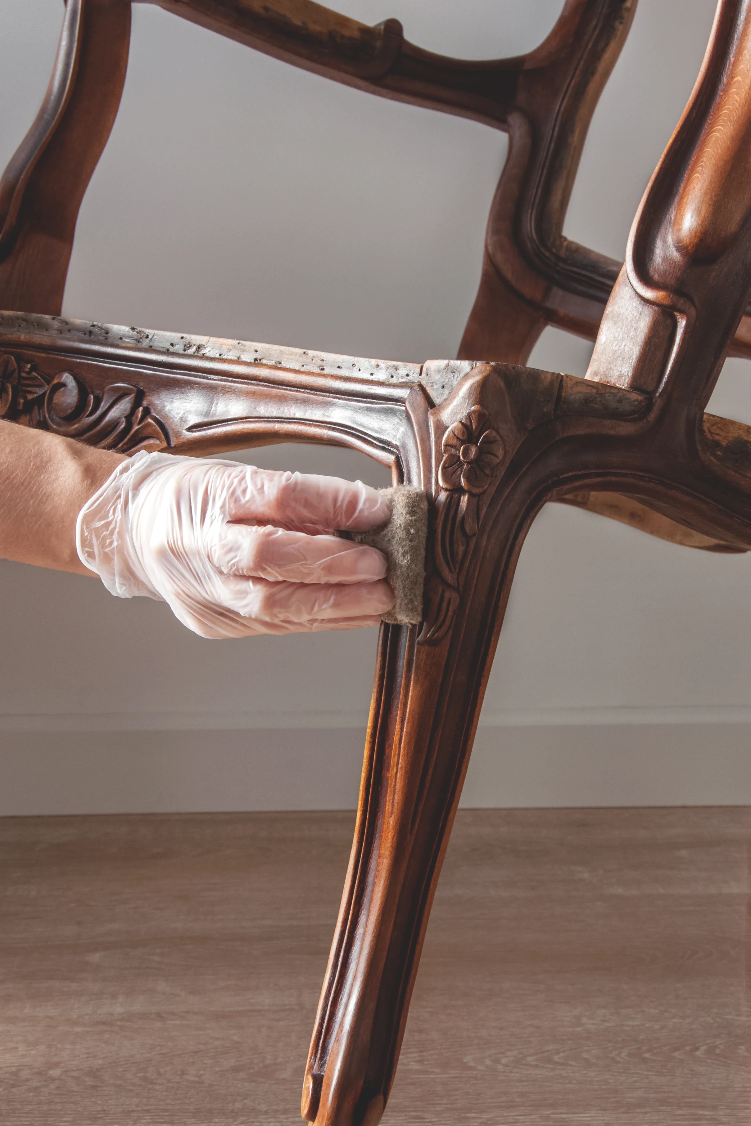
Furniture Restoration
Art Direction / Visual Identity / Social Media
Presentation / Collaterals & Merch / UI
Vinder AS is a Norwegian furniture restoration company dedicated to bringing your cherished, memory-filled pieces back to life. With a strong belief that every piece of furniture deserves a second chance, they focus on restoring rather than discarding, helping to reduce waste. At the heart of their business is a commitment to caring for the environment, innovating the old instead of letting it end up in a landfill.
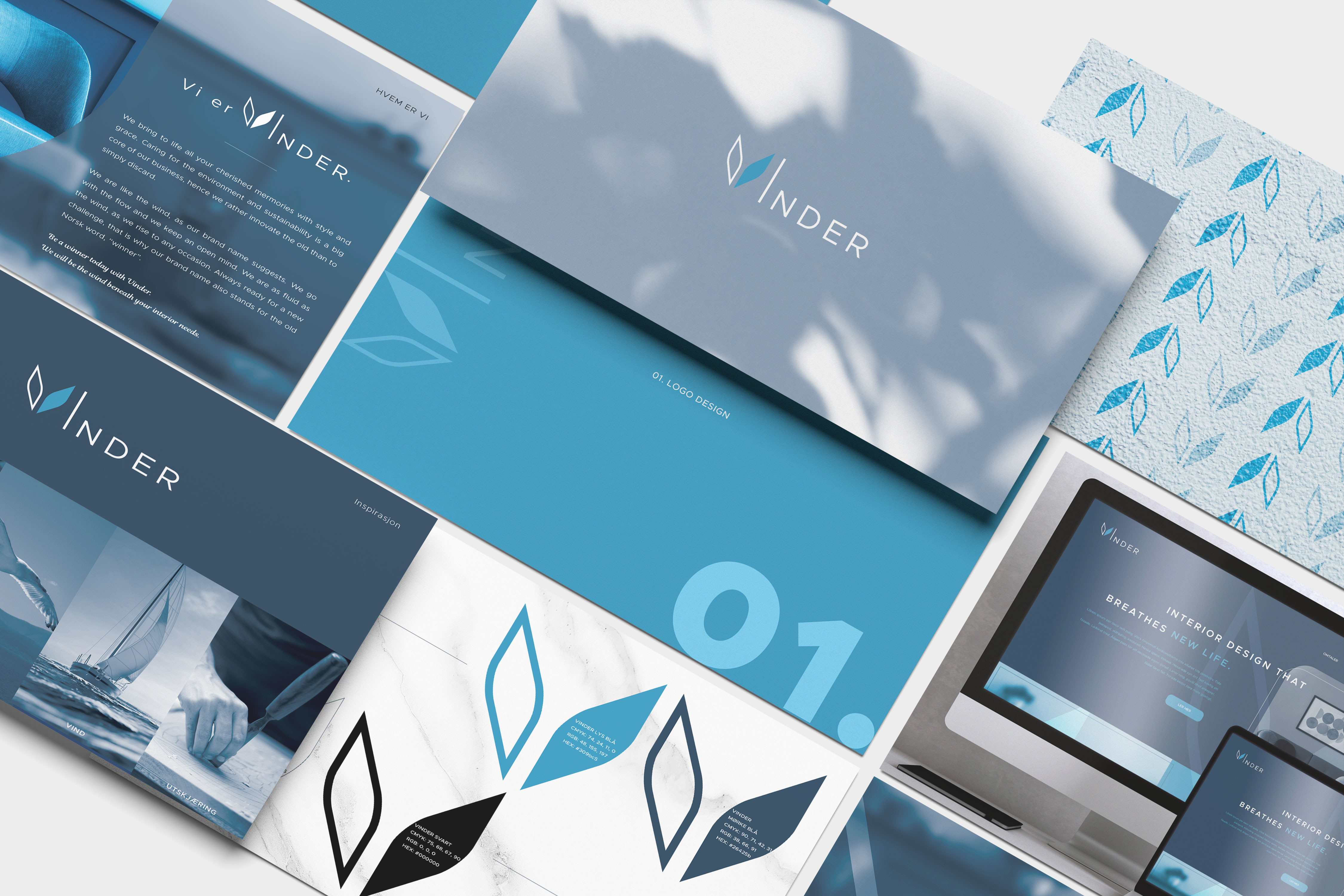
VISUAL IDENTITY + BRAND STRATEGY
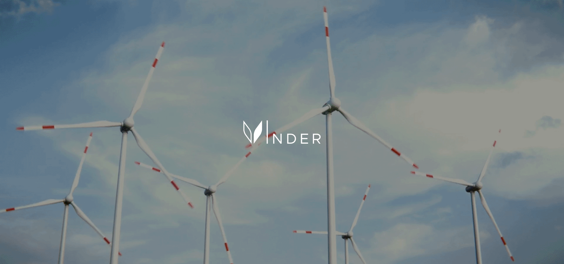
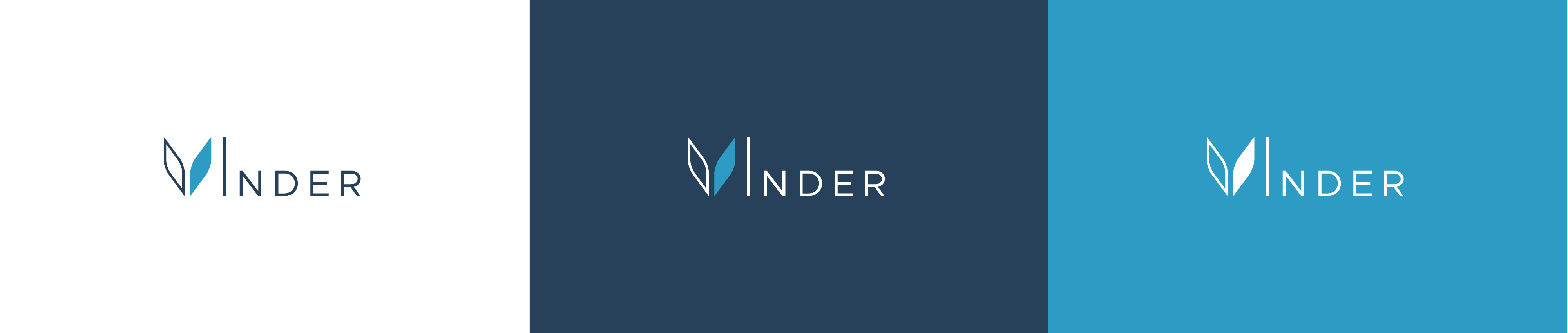
The brand name Vinder is a fusion of two Norwegian words: “Vinner” (meaning “winner”) and “Vind” (meaning “wind”). The logo symbolizes Vinder AS as a champion, soaring high in the blue skies or sailing smoothly across the seas, with the wind in their sails. We also emphasised on the Norwegian engineering expertise behind their restoration process, showcasing precision and craftsmanship.
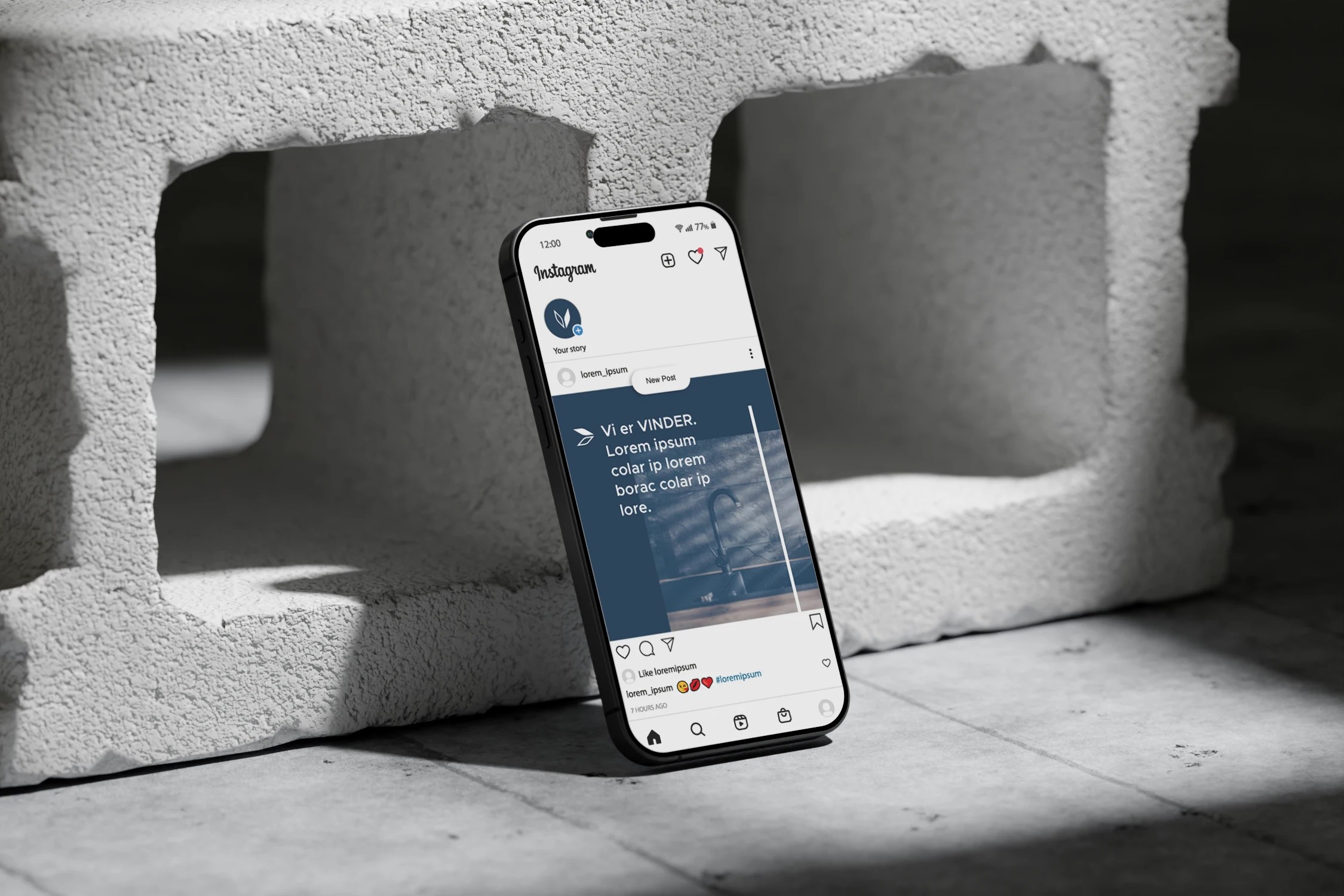
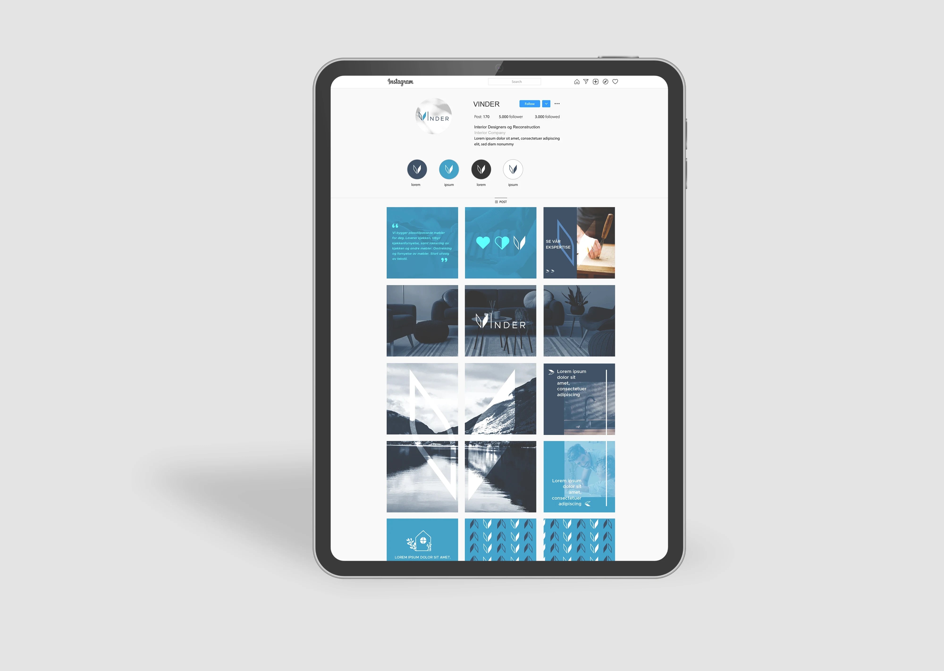
DIGITAL STRATEGY
Adapting the new visual identity across the website and social media presence reinforces brand recognition and strengthens the overall identity. By ensuring consistency across all platforms, the new logo and design elements become more memorable, effectively driving traffic, increasing engagement, and enhancing brand awareness.


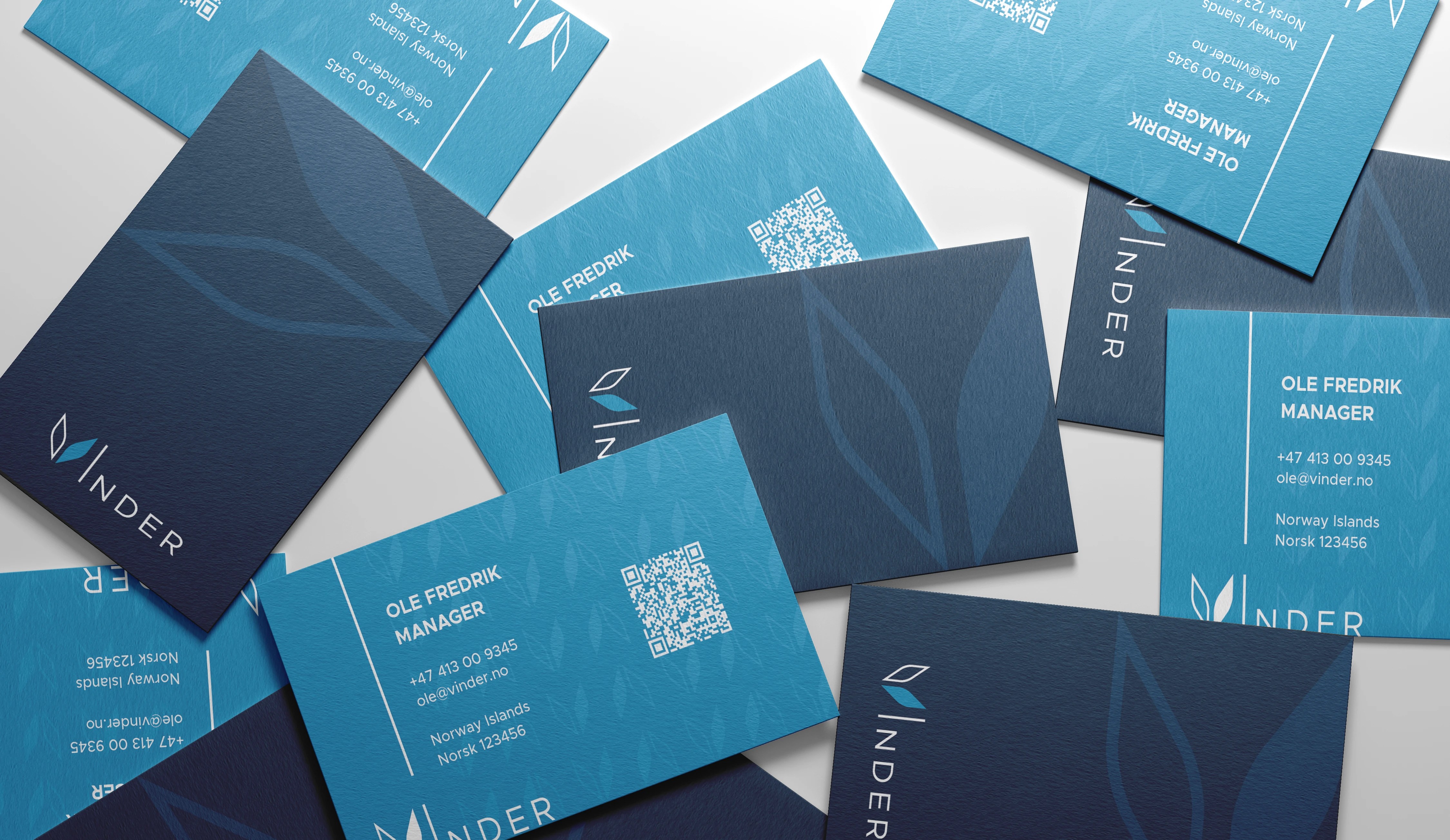
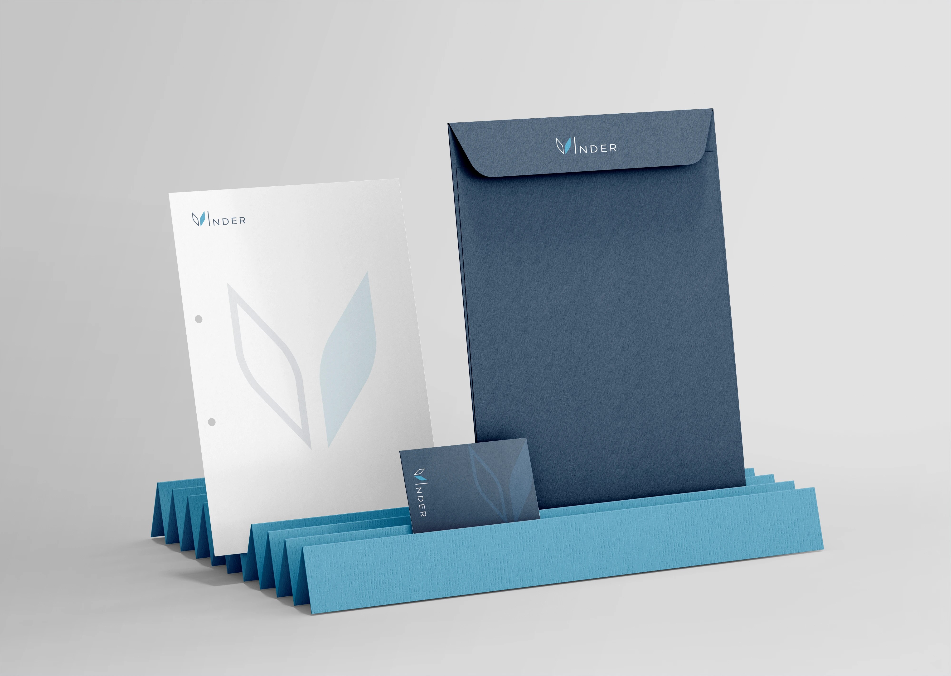
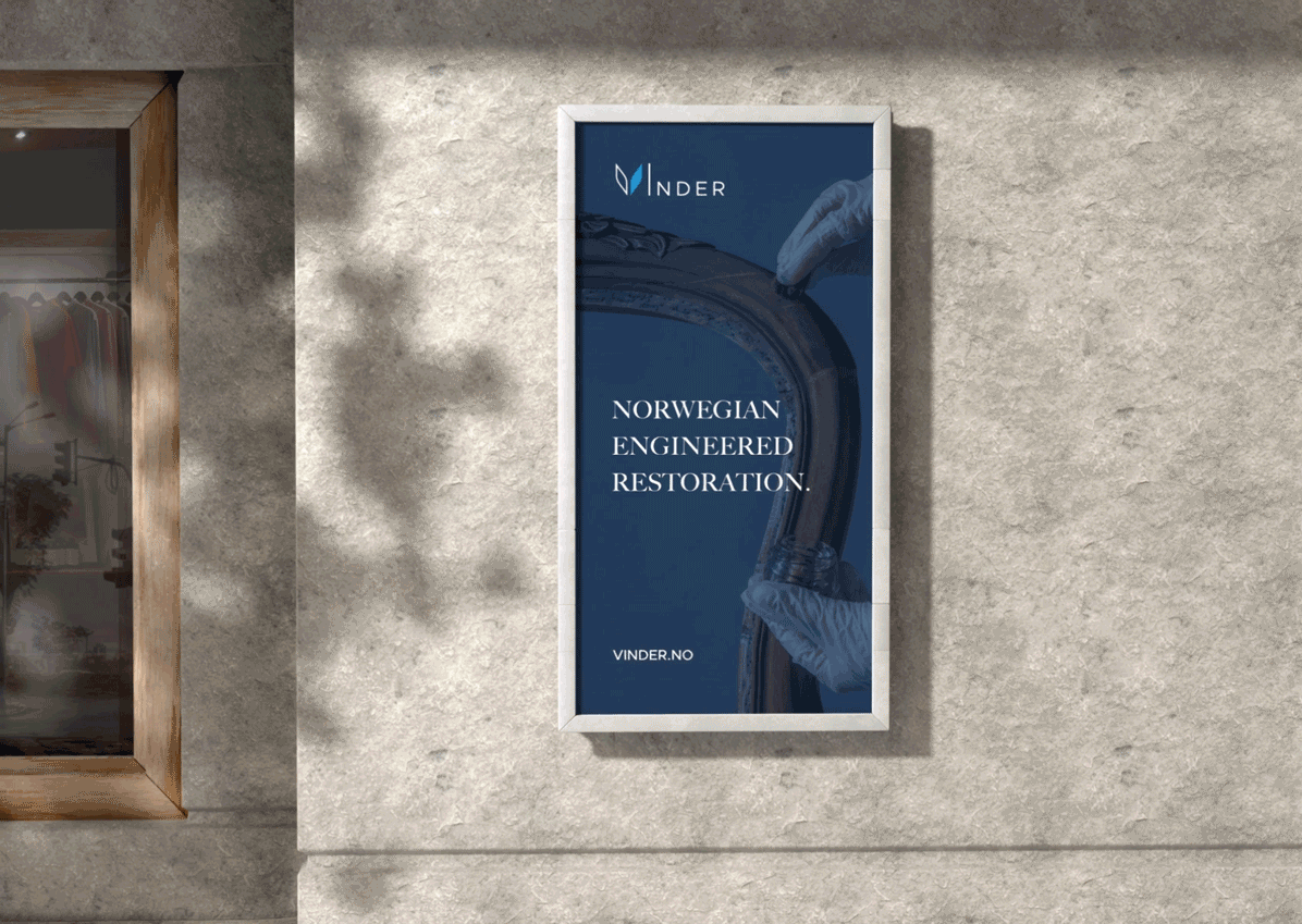
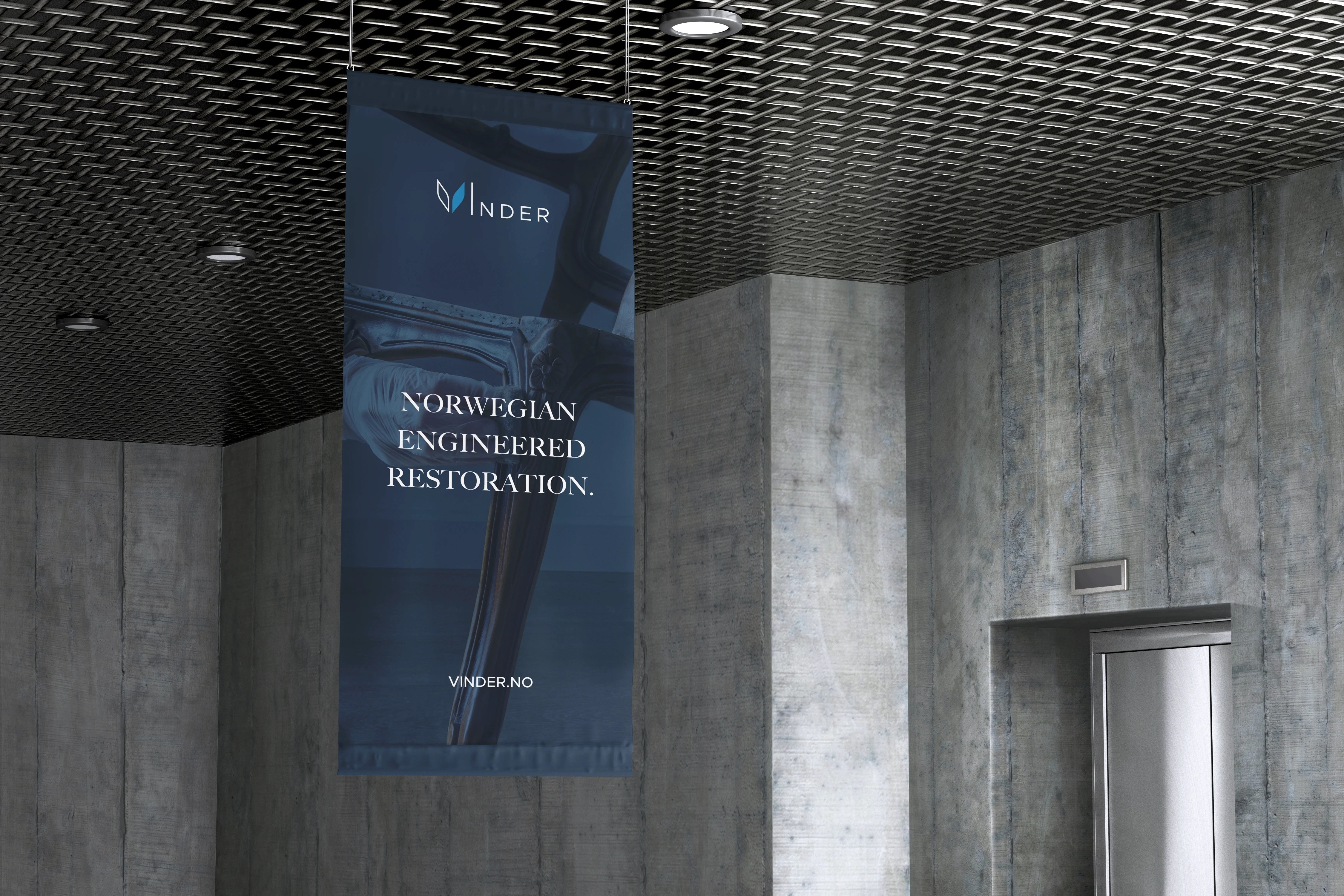
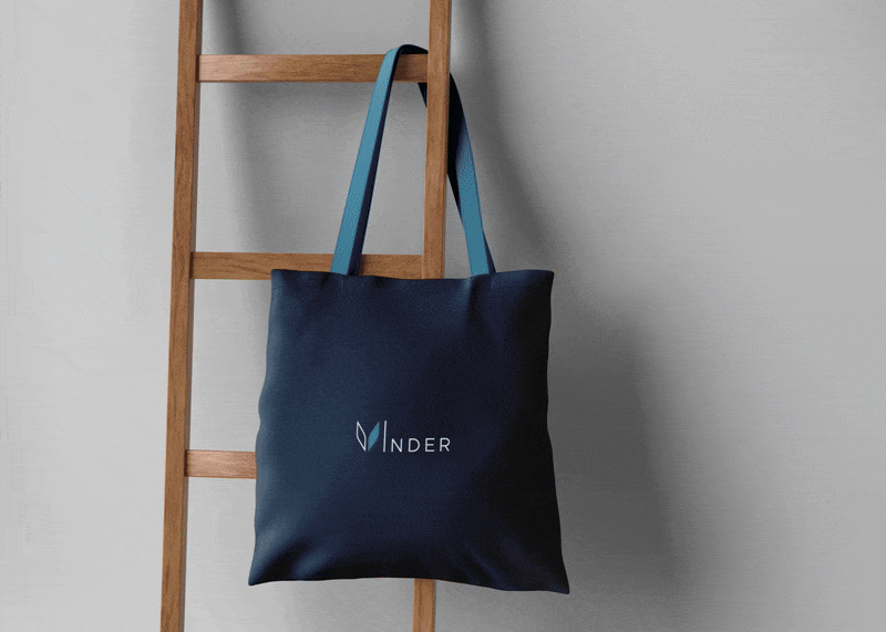
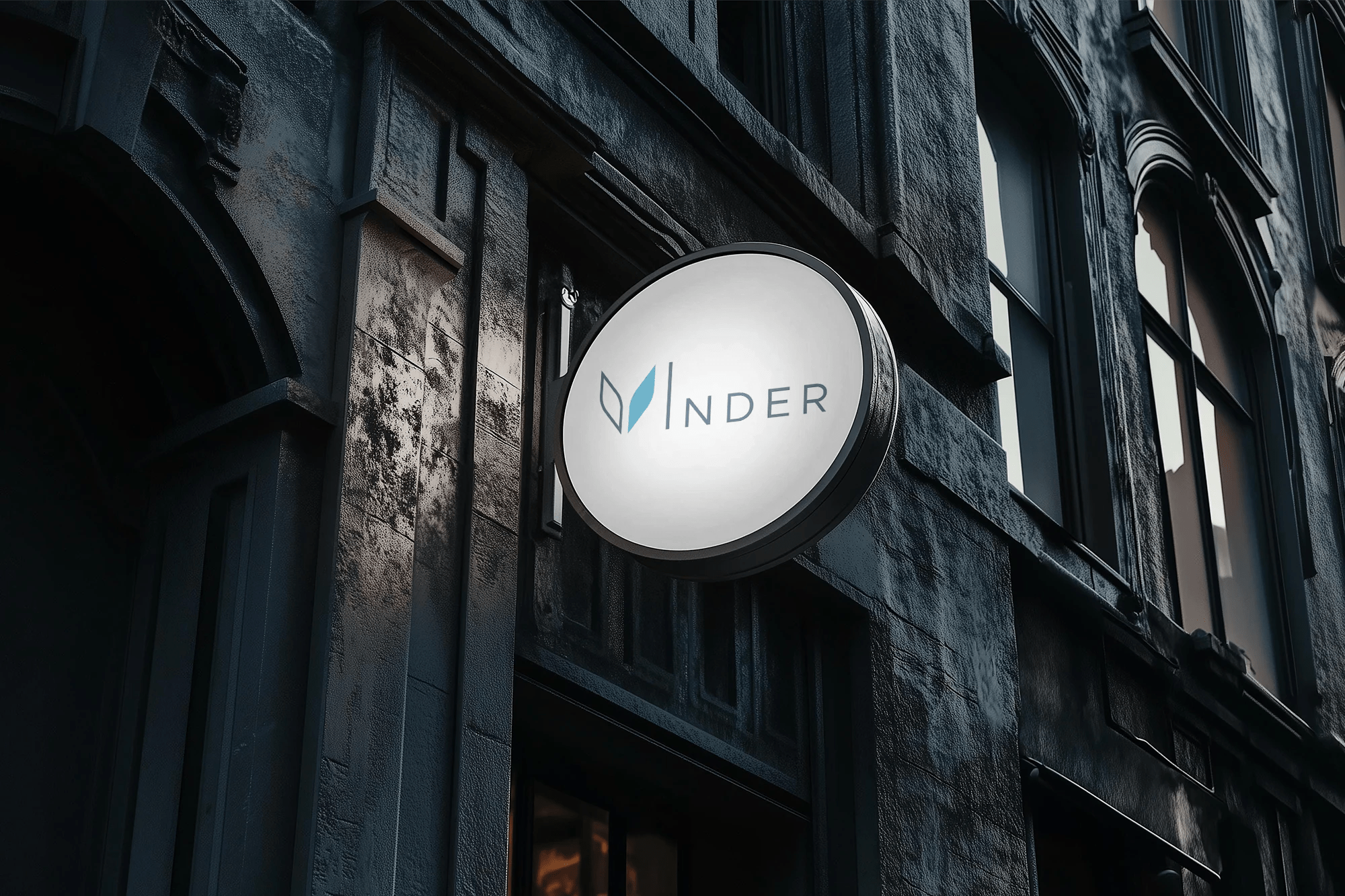
PRINT / COLLATERALS / OOH
Similarly, the new visual identity will be applied across various presentation layouts, print materials, other types of collaterals, and outdoor formats to extend brand visibility and reinforce its presence. This cohesive approach ensures a recognisable brand identity, reaching a wider audience.